Swing Designer Palette

Swing Designer provides the following palette for creating Swing applications.

The palette may be fully configured using the Palette Manager.

  • JPanel - A generic lightweight container.
  • JScrollPane - Provides a scrollable view of a lightweight component. A JScrollPane manages a viewport, optional vertical and horizontal scroll bars, and optional row and column heading viewports.
  • JSplitPane - JSplitPane is used to divide two (and only two) Components. The two Components are graphically divided based on the look and feel implementation, and the two Components can then be interactively resized by the user.
  • JTabbedPane - A component that lets the user switch between a group of components by clicking on a tab with a given title and/or icon.
  • JToolBar - A component that is useful for displaying commonly used Action's or controls.
  • JDesktopPane - A container used to create a multiple-document interface or a virtual desktop.
  • JInternalFrame - A lightweight object that provides many of the features of a native frame, including dragging, closing, becoming an icon, resizing, title display, and support for a menu bar.

  • Absolute Layout - A absolute layout displays components with specified bounds.
  • FlowLayout - A flow layout arranges components in a left-to-right flow, much like lines of text in a paragraph. Flow layouts are typically used to arrange buttons in a panel. It will arrange buttons left to right until no more buttons fit on the same line.
  • BorderLayout - A border layout lays out a container, arranging and resizing its components to fit in five regions: north, south, east, west, and center. Each region may contain no more than one component.
  • GridLayout - The GridLayout class is a layout manager that lays out a container's components in a rectangular grid. The container is divided into equal-sized rectangles, and one component is placed in each rectangle.
  • GridBagLayout - The GridBagLayout class is a flexible layout manager that aligns components vertically and horizontally, without requiring that the components be of the same size. Each GridBagLayout object maintains a dynamic, rectangular grid of cells, with each component occupying, one or more cells.
  • CardLayout - A CardLayout object is a layout manager for a container. It treats each component in the container as a card. Only one card is visible at a time, and the container acts as a stack of cards. The first component added to a CardLayout object is the visible component when the container is first displayed.
  • BoxLayout - A layout manager that allows multiple components to be laid out either vertically or horizontally. The components will not wrap so, for example, a vertical arrangement of components will stay vertically arranged when the frame is resized.
  • FormLayout - JGoodies FormLayout is a powerful, flexible and precise general purpose layout manager. It aligns components vertically and horizontally in a dynamic rectangular grid of cells, with each component occupying one or more cells.
  • SpringLayout - A SpringLayout lays out the children of its associated container according to a set of constraints for each side.
  • GroupLayout - GroupLayout mixes grid layout and free form layout.

  • Horizontal Box - Creates a panel that uses an implicit horizontal BoxLayout.
  • Vertical Box - Creates a panel that uses an implicit vertical BoxLayout.
  • Horizontal strut - Creates an invisible, fixed-width component .
  • Vertical strut - Creates an invisible, fixed-height component .
  • Horizontal glue - Creates a horizontal glue component .
  • Vertical glue - Creates a vertical glue component .
  • Rigid area - Creates an invisible component that's always the specified size .
  • Glue - Creates an invisible glue component .

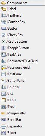
  • JLabel - A display area for a short text string or an image, or both. A label does not react to input events. As a result, it cannot get the keyboard focus. A label can, however, display a keyboard alternative as a convenience for a nearby component that has a keyboard alternative but can't display it.
  • JTextField - A lightweight component that allows the editing of a single line of text.
  • JComboBox - A component that combines a button or editable field and a drop-down list. The user can select a value from the drop-down list, which appears at the user's request. If you make the combo box editable, then the combo box includes an editable field into which the user can type a value.
  • JButton - An implementation of a "push" button.
  • JCheckBox - An implementation of a check box -- an item that can be selected or deselected, and which displays its state to the user. By convention, any number of check boxes in a group can be selected.
  • JRadioButton - An implementation of a radio button -- an item that can be selected or deselected, and which displays its state to the user. Used with a ButtonGroup object to create a group of buttons in which only one button at a time can be selected.
  • JToggleButton - An implementation of a two-state button -- an item that can be selected or deselected, and which displays its state to the user.
  • JTextArea - A JTextArea is a multi-line area that displays plain text. 
  • JFormattedTextField - A lightweight component that allows the editing of a single line of text using a predefined mask.
  • JPasswordField - A lightweight component that allows the editing of a single line of text where the view indicates something was typed, but does not show the original characters.
  • JTextPane - A text component that can be marked up with attributes that are represented graphically.
  • JEditorPane - A text component to edit various kinds of content.
  • JSpinner - A lightweight component that allows the lets the user select a number or an object value from an ordered sequence.
  • JList - A component that allows the user to select one or more objects from a list.
  • JTable - The JTable is used to display and edit regular two-dimensional tables of cells.
  • JTable on JScrollPane - A JTable placed within a JScrollPane.
  • Table model column - A JTable model column.
  • JTree - A control that displays a set of hierarchical data as an outline.
  • JProgressBar - A component that, by default, displays an integer value within a bounded interval. A progress bar typically communicates the progress of some work by displaying its percentage of completion and possibly a textual display of this percentage.
  • JScrollBar - An implementation of a scrollbar. The user positions the knob in the scrollbar to determine the contents of the viewing area. The program typically adjusts the display so that the end of the scrollbar represents the end of the displayable contents, or 100% of the contents.
  • JSeparator - A horizontal or vertical line used to separate other controls.
  • JSlider - A component that lets the user graphically select a value by sliding a knob within a bounded interval. The slider can show both major tick marks and minor tick marks between them. The number of values between the tick marks is controlled with setMajorTickSpacing and setMinorTickSpacing.

  • JMenuBar - A menu bar.
  • JPopupMenu - A popup menu.
  • JMenu - Either a pull-down or cascaded menu.
  • JMenuItem - A simple menu item.
  • JCheckBoxMenuItem - A checkbox menu item.
  • JRadioButtonMenuItem - A radio button menu item.

  • Panel - Panel is the simplest container class. A panel provides space in which an application can attach any other component, including other panels.
  • Canvas - A Canvas component represents a blank rectangular area of the screen onto which the application can draw or from which the application can trap input events from the user.
  • ScrollPane - A container class which implements automatic horizontal and/or vertical scrolling for a single child component.
  • Button - This class creates a labeled button. The application can cause some action to happen when the button is pushed.
  • Label - A Label object is a component for placing text in a container. A label displays a single line of read-only text. The text can be changed by the application, but a user cannot edit itdirectly.
  • Checkbox - A check box is a graphical component that can be in either an "on" (true) or "off" (false) state. Clicking on a check box changes its state from "on" to "off", or from "off" to "on".
  • Choice - The Choice class presents a pop-up menu of choices. The current choice is displayed as the title of the menu.
  • List - The List component presents the user with a scrolling list of text items. The list can be set up so that the user can choose either one item or multiple items.
  • Scrollbar - The Scrollbar class embodies a scroll bar, a familiar user-interface object. A scroll bar provides a convenient means for allowing a user to select from a range of values.
  • TextField - A TextField object is a text component that allows for the editing of a single line of text.
  • TextArea - A TextArea object is a multi-line region that displays text. It can be set to allow editing or to be read-only.