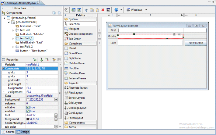
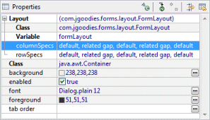
JGoodies FormLayout is a powerful, flexible and precise general purpose layout manager. It aligns components vertically and horizontally in a dynamic rectangular grid of cells, with each component occupying one or more cells. A whitepaper about the FormLayout available online. To use FormLayout you first define the grid by specifying the columns and rows. In a second step you add components to the grid. You can specify columns and rows via human-readable String descriptions or via arrays of ColumnSpec and RowSpec instances. Each component managed by a FormLayout is associated with an instance of CellConstraints. The constraints object specifies where a component should be located on the form’s grid and how the component should be positioned. In addition to its constraints object the FormLayout also considers each component’s minimum and preferred sizes in order to determine a component’s size.
This layout also requires the use of the JGoodies FormLayout jar file (forms-1.0.6.jar or higher).
This feature is based on technology from the JGoodies Forms.
http://www.jgoodies.com/freeware/forms/
Copyright © 2002-2009 JGoodies Karsten Lentzsch
Main Features
-
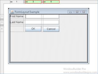
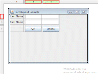
Select JGoodies FormLayout from the Layouts palette and drop it on a JFrame or JPanel
-
The JGoodies FormLayout jar file (forms-1.1.0.jar) will automatically be added to your project and the classpath adjusted
-
Graphical feedback is provided for all column, row and cell interactions
-
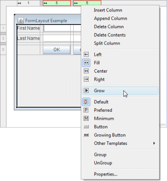
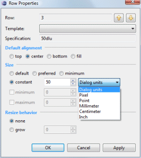
Column and row properties may be changed via a popup menu or property dialog
-
Convert existing layouts (null, GridBagLayout, etc.) to JGoodies FormLayout with intelligent column, row and gap creation
-
Automatically add gaps when adding new columns or rows
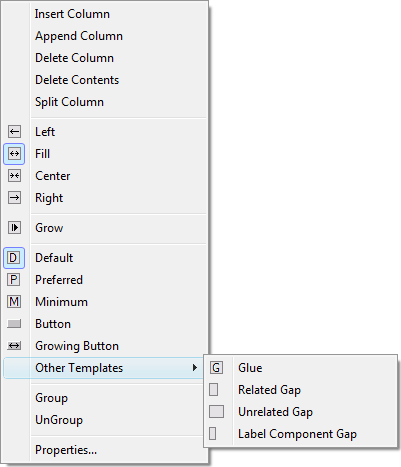
Popup Header Menu
-
Right-click on the header area to access the popup header menu
-
Insert new columns or rows before the current column or row
-
Add a new column or row at the end of the current list
-
Delete entire columns or rows or just their widget contents
-
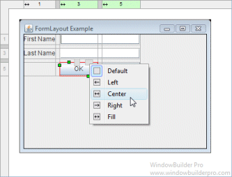
Set the column alignment to left, right, center or fill
-
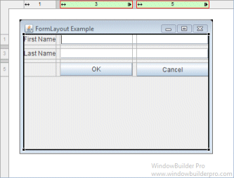
Specify that the column or row should grow to fill the available space
-
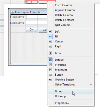
Group or ungroup columns or rows
-
Set the sizing spec that should be used for the column or row (various column, row and gap types are available)
-
Edit the properties of the current column or row
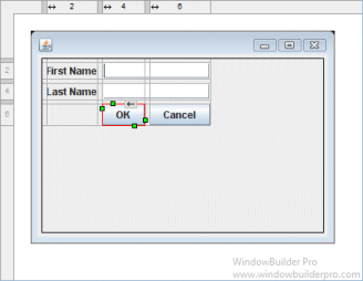
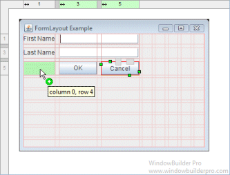
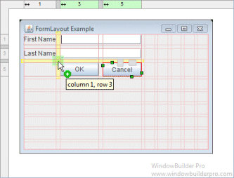
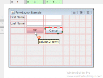
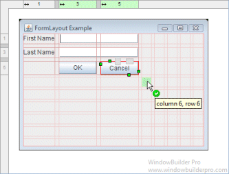
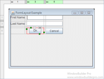
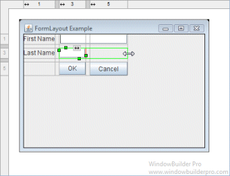
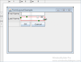
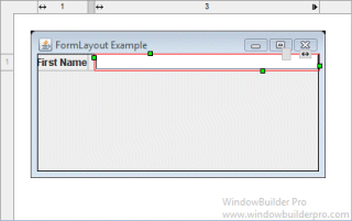
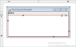
Graphical Feedback
-
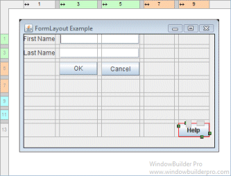
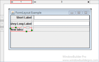
When moving a widget or adding a new widget, open cells are highlighted green while populated cells are highlighted red and insertion points are highlighted in yellow
-
Phantom drop point to the right and below the current cells will create new columns, rows and gaps as needed
-
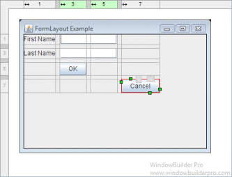
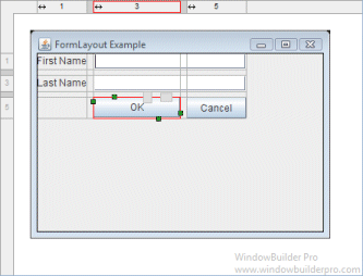
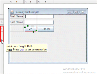
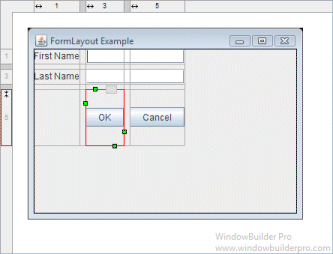
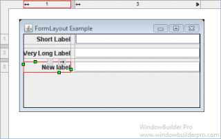
The currently selected cell shows its column and row spanning handles and alignment handles
-
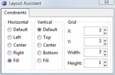
Set the alignment of a cell using its popup alignment menu or the toolbar

-
Right-click on a column to set its grow property
-
Grouped columns and rows are color highlighted to indicate which are in the same group
-
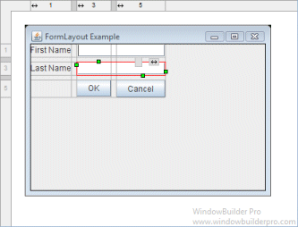
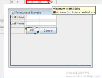
Column and row sizing handles make it easy to set the size of a column or row
-
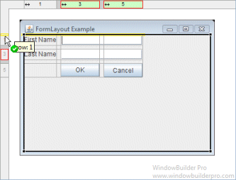
Reorder columns and rows by dragging them (with their associated gap columns or rows)
-
Column and rows borders are indicated with gray lines
-
Interactive column and row spanning feedback is provided
-
Full keyboard support for quickly changing alignment values
Cell D
default horizontal
Shift+D
default vertical
F
fill horizontal
Shift+F
fill vertical
L, C, R
left/center/right for horizontal
T, M, B
top/middle/bottom for vertical
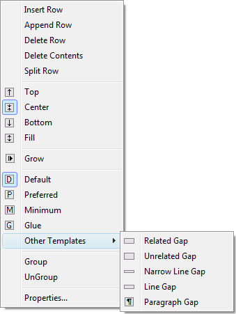
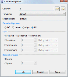
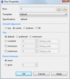
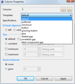
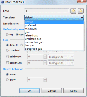
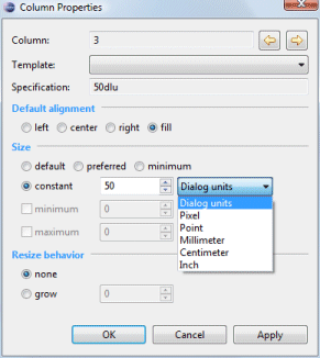
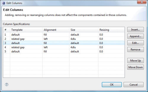
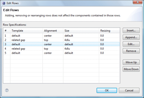
Column & Row Editing
-
Double click on a column or row to access its property dialog
-
Switch between columns and rows using the arrow buttons
-
Select from any of the predefined column or gap templates
-
Set the column or row alignment
-
Specify the resize behavior and the relative weights of each column or row
-
Set the size of the column or row
-
Specify a constant size in a variety of units
-
Specify minimum and maximum sizes
-
-
Floating layout assistant for constraints

-
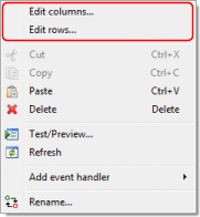
Open the Columns or Rows editing dialog from the Property Pane or the right-click context menu of the panel.
-
Insert or add new columns and rows
-
Open the property dialog for an individual column or row
-
Group and ungroup columns or rows
-
Rearrange the order of the columns or rows
Preferences
-
Control whether automatic grab is used for text widgets, comboboxes, tables, etc.
-
Control whether labels are automatically right-aligned when next to a text widget
Source Code Generation & Parsing
-
Intelligently convert existing layouts (null, GridBagLayout, etc.) to JGoodies FormLayout with column, row and gap creation
-
Generated code will use predefined FormFactory constants as necessary
-
Parser can understand reused CellConstraint objects
-
Parser supports all CellConstraint styles
-
Creation methods intended for use by humans
CellConstraints cc = new CellConstraints(); cc.xy(2, 1); // second col, first row cc.xy(2, 1, "right, bottom"); // aligned to right and bottom cc.xy(2, 1, "r, b"); // abbreviated alignment cc.xywh(2, 1, 4, 3); // spans 4 cols, 3 rows cc.xywh(2, 1, 4, 3, "right, bottom"); cc.xywh(2, 1, 4, 3, "r, b"); -
Constructors intended for builders
new CellConstraints(); // first col, first row new CellConstraints(2, 1); new CellConstraints(2, 1, 4, 3); new CellConstraints(2, 1, CellConstraints.RIGHT, CellConstraints.BOTTOM); -
Constructors intended for building UIs from XML
CellConstraints cc = new CellConstraints();
new CellConstraints("2, 1");
new CellConstraints("2, 1, r, b");
new CellConstraints("2, 1, 4, 3");
new CellConstraints("2, 1, 4, 3, r, b");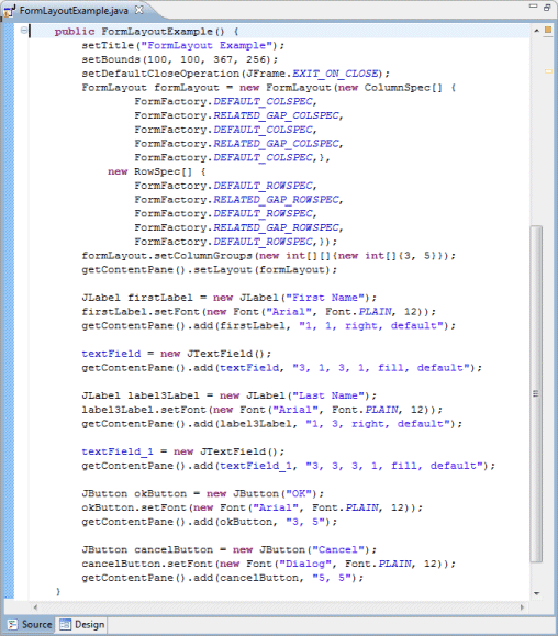
-