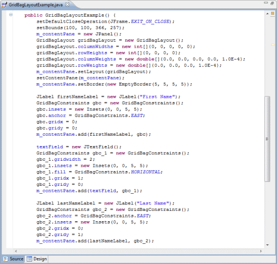
The GridBagLayout class is a flexible layout manager that aligns components vertically, horizontally or along their baseline without requiring that the components be of the same size. Each GridBagLayout object maintains a dynamic, rectangular grid of cells, with each component occupying one or more cells, called its display area. Each component managed by a GridBagLayout is associated with an instance of GridBagConstraints. The constraints object specifies where a component’s display area should be located on the grid and how the component should be positioned within its display area. In addition to its constraints object, the GridBagLayout also considers each component’s minimum and preferred sizes in order to determine a component’s size.
Main Features
-
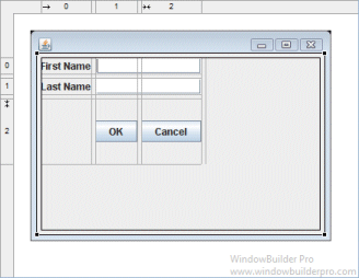
Select GridBagLayout from the Layouts palette and drop it on a JFrame or JPanel
-
Graphical feedback is provided for all column, row and cell interactions
-
Column and row properties may be changed via a popup menu or property dialog
-
Convert existing layouts (null, FormLayout, etc.) to GridBagLayout with intelligent column, row and gap creation
-
Automatically add gaps (insets) when adding new columns or rows
Popup Header Menu
-
Right-click on the header area to access the popup header menu
-
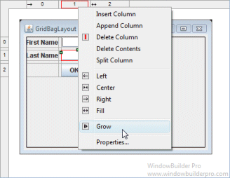
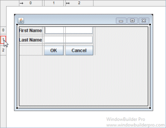
Insert new columns or rows before the current column or row
-
Add a new column or row at the end of the current list
-
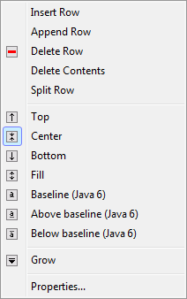
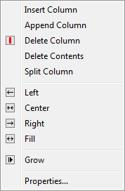
Delete entire columns or rows or just their widget contents
-
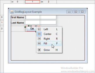
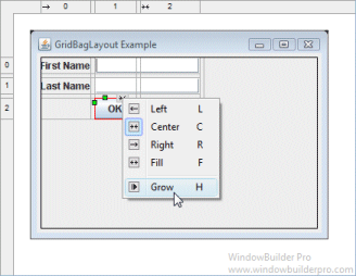
Set the column alignment to left, right, center or fill
-
Specify that the column or row should grow to fill the available space
-
Edit the properties of the current column or row
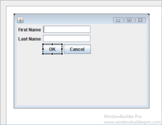
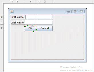
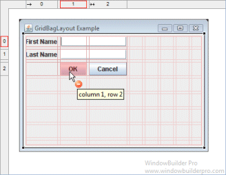
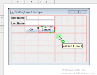
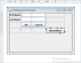
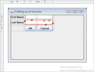
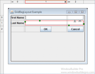
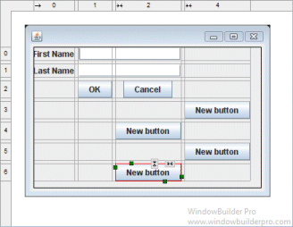
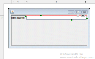
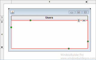
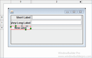
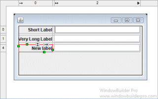
Graphical Feedback
-
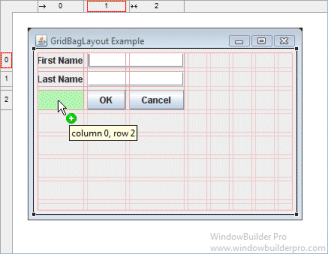
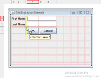
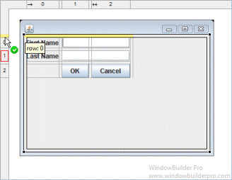
When moving a widget or adding a new widget, open cells are highlighted green while populated cells are highlighted red and insertion points are highlighted in yellow
-
Phantom drop point to the right and below the current cells will create new columns, rows and gaps as needed
-
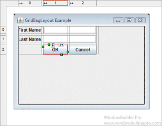
The currently selected cell shows its column and row spanning handles and alignment handles
-
Set the alignment of a cell using its popup alignment menu or the toolbar

-
Set the grow property by using a cell’s popup alignment menu or right-clicking on a column
-
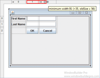
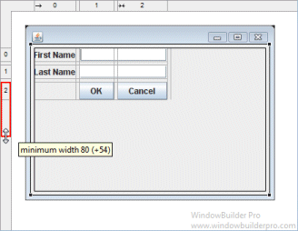
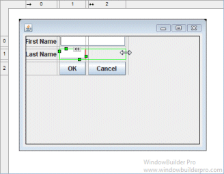
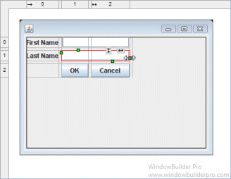
Column and row sizing handles make it easy to set the size of a column or row
-
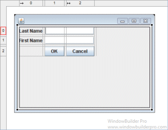
Reorder columns and rows by dragging them (with their associated gap columns or rows)
-
Column and rows borders are indicated with gray lines
-
Interactive column and row spanning feedback is provided
-
Full keyboard support for quickly changing alignment values
Cells |
|
F |
fill horizontal |
Shift+F |
fill vertical |
H |
grow horizontal |
V |
grow vertical |
L, C, R |
left/center/right for horizontal |
T, M, B |
top/middle/bottom for vertical |
Shift+L |
vertical baseline |
Shift+A |
above baseline |
Shift+B |
below baseline |
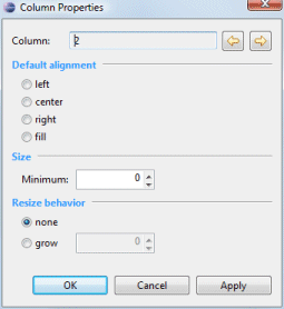
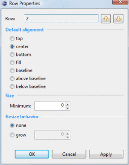
Column & Row Editing
-
Double click on a column or row to access its property dialog
-
Switch between columns and rows using the arrow buttons
-
Set the column or row alignment
-
Specify the resize behavior of each column or row
-
Set the minimum size of the column or row
-
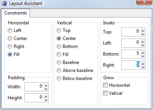
Floating layout assistant

-
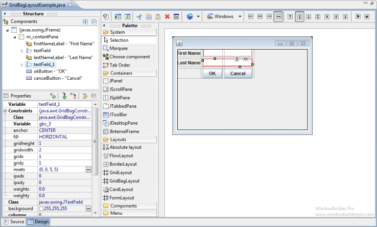
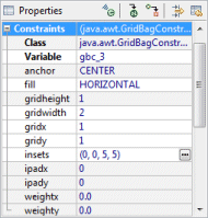
Edit individual constraint properties for each widget in the property pane
Preferences
-
Control whether to use the long or short constructor style for GridBagConstraints
-
Control whether automatic grab is used for text widgets, comboboxes, tables, etc.
-
Control whether labels are automatically right-aligned when next to a text widget
Source Code Generation & Parsing
-
Intelligently convert existing layouts (null, FormLayout, etc.) to GridBagLayout with column, row and gap creation
-
Parser can understand long or short constructor style for GridBagConstraints