-
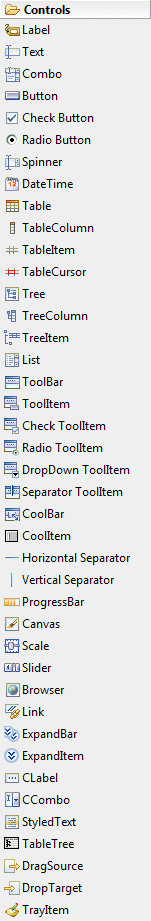
Label - Instances of this class represent a non-selectable user interface object that displays a
string or image. When SEPARATOR is specified, displays a single vertical or horizontal line.
-
Text - Instances of this class are selectable user interface objects that allow the user to enter
and modify text.
-
Combo - Instances of this class are controls that allow the user to choose an item from a list of
items, or optionally enter a new value by typing it into an editable text field.
-
Button - Instances of this class represent a selectable user interface object that issues notification
when pressed and released.
-
Check Button - Instances of this class represent a selectable user interface object that issues notification
when checked and unchecked.
-
Radio Button - Instances of this class represent a selectable user interface object that issues notification
when selected and unselected.
-
Spinner - Instances of this class are selectable user interface objects that allow the user to enter
and modify numeric values.
-
DateTime - Instances of this class are selectable user interface objects that allow the user to enter
and modify date or time values.
-
Table - Instances of this class implement a selectable user interface object that displays a list of
images and strings and issue notification when selected.
-
TableColumn - Instances of this class represent a column in a table widget.
-
TableItem - Instances of this class represent a selectable user interface object that represents an item
in a table.
-
TableCursor - A TableCursor provides a way for the user to navigate around a Table using the keyboard. It
also provides a mechanism for selecting an individual cell in a table.
-
Tree - Instances of this class provide a selectable user interface object that displays a hierarchy
of items and issue notification when an item in the hierarchy is selected.
-
TreeColumn - Instances of this class represent a column in a tree widget.
-
TreeItem - Instances of this class represent a selectable user interface object that represents an item
in a tree.
-
List - Instances of this class represent a selectable user interface object that displays a list of
strings and issues notification when a string selected. A list may be single or multi select.
-
ToolBar - Instances of this class support the layout of selectable tool bar items.
-
ToolItem - Instances of this class represent a selectable user interface object that represents a button
in a tool bar.
-
Check ToolItem - Instances of this class represent a selectable user interface object that represents a button
in a tool bar that can be checked and unchecked.
-
Radio ToolItem - Instances of this class represent a selectable user interface object that represents a button
in a tool bar such that only one from group can be selected.
-
DropDown ToolItem - Instances of this class represent a selectable user interface object that represents a button
in a tool bar that can show drop-down menu when clicked.
-
Separator ToolItem - Instances of this class represent a selectable user interface object that represents a
separator in a tool bar.
-
CoolBar - Instances of this class provide an area for dynamically positioning the items they contain.
-
CoolItem - Instances of this class are selectable user interface objects that represent the dynamically
positionable areas of a CoolBar.
-
Horizontal Separator - Horizontal separator.
-
Vertical Separator - Vertical separator.
-
ProgressBar - Instances of the receiver represent is an unselectable user interface object that is used to
display progress, typically in the form of a bar.
-
Canvas - Instances of this class provide a surface for drawing arbitrary graphics.
-
Scale - Instances of this class are selectable user interface objects that represent a range of
positive, numeric values.
-
Slider - Instances of this class are selectable user interface objects that represent a range of
positive, numeric values.
-
Browser - A Browser implement the browser user interface metaphor. It allows the user to visualize and
navigate through HTML documents (Eclipse 3.0 and above only).
-
Link - Instances of this class represent a selectable user interface object that displays a text
with links.
-
ExpandBar - Instances of this class support the layout of selectable expand bar items.
-
ExpandItem - Instances of this class represent a selectable user interface object that represents a
expandable item in a expand bar.
-
CLabel - A Label which supports aligned text and/or an image and different border styles.
-
CCombo - The CCombo class represents a selectable user interface object that combines a text field and
a list and issues notificiation when an item is selected from the list.
-
StyledText - A StyledText is an editable user interface object that displays lines of text.
-
DragSource - DragSource defines the source object for a drag and drop transfer.
-
DropTarget - DropTarget defines the target object for a drag and drop transfer.
-
TrayItem - Constructs a new instance of this class given its parent (which must be a Tray) and a style
value describing its behavior and appearance. The item is added to the end of the items
maintained by its parent.