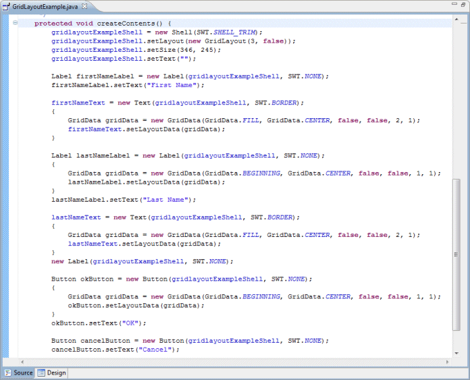
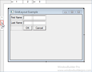
GridLayout lays out the control children of a Composite in a grid. GridLayout has a number of configuration fields, and the controls it lays out can have an associated layout data object, called GridData. The power of GridLayout lies in the ability to configure GridData for each control in the layout. The numColumns field is the most important field in a GridLayout. Widgets are laid out in columns from left to right, and a new row is created when numColumns + 1 controls are added to the Composite.
Main Features
-
Select GridLayout from the Layouts palette and drop it on a Window or Composite
-
Graphical feedback is provided for all column, row and cell interactions
-
Column and row properties may be changed via a popup menu
-
Convert existing layouts (null, FormLayout, etc.) to GridLayout with intelligent column and row creation
Popup Header Menu
-
Right-click on the header area to access the popup header menu
-
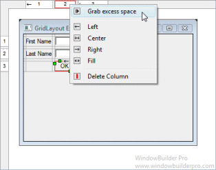
Delete entire columns or rows
-
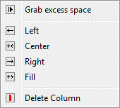
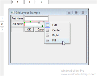
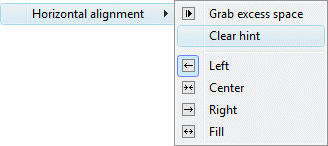
Set the column alignment to left, center, right or fill
-
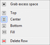
Set the row alignment to top, center, bottom or fill
-
Specify that the column or row should grab any excess space
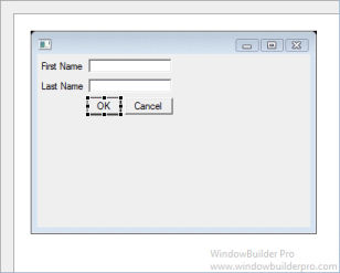
Graphical Feedback
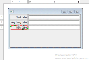
-
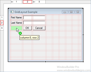
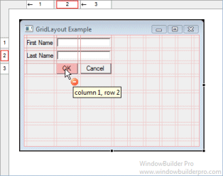
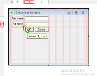
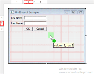
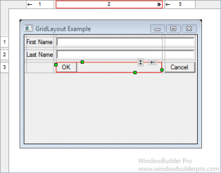
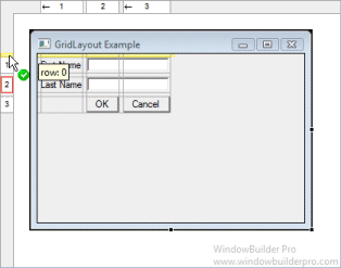
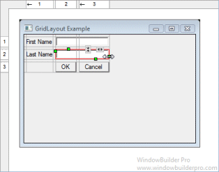
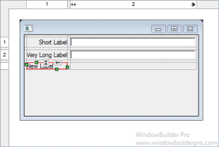
When moving a widget or adding a new widget, open cells are highlighted green while populated cells are highlighted red and insertion points are highlighted in yellow
-
Phantom drop point to the right and below the current cells will create new columns, rows and gaps as needed
-
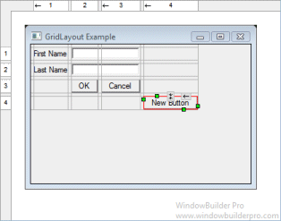
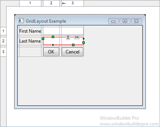
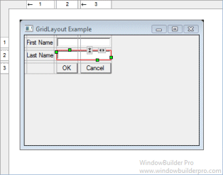
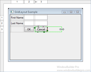
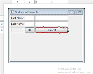
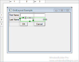
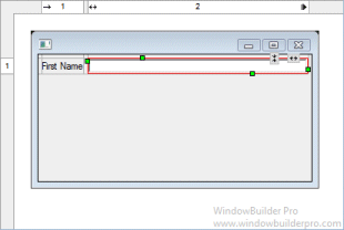
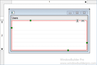
The currently selected cell shows its column and row spanning handles, sizing handles and alignment handles
-
Set the alignment of a cell using its popup alignment menu or the toolbar
-
Set the grab property by right-clicking (or double-clicking) on a column or row
-
Width and height sizing handles make it easy to set the size of a widget
-
Right-click a widget to set is horizontal or vertical alignment values, grab property or to clear its width or height hint
-
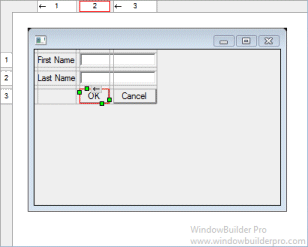
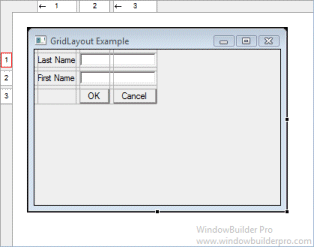
Reorder columns and rows by dragging them (with their associated gap columns or rows)
-
Column and rows borders are indicated with gray lines
-
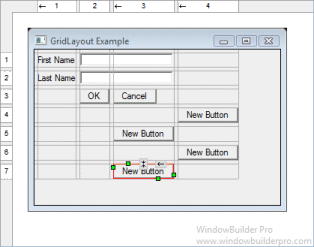
Interactive column and row spanning feedback is provided
-
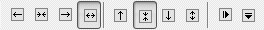
Full keyboard support for quickly changing alignment values
Cells |
|
|---|---|
F |
fill horizontal |
Shift+F |
fill vertical |
H |
grow horizontal |
V |
grow vertical |
L, C, R |
left/center/right for horizontal |
T, M, B |
top/middle/bottom for vertical |
Cell Editing
-
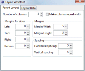
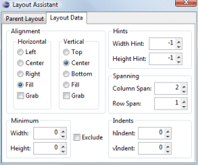
Floating layout assistant

-
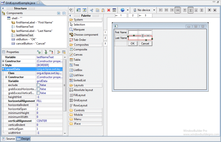
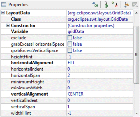
Edit individual layout data properties for each widget in the Property Pane.
Preferences
-
Control whether automatic grab is used for text widgets, comboboxes, tables, etc.
-
Control whether labels are automatically right-aligned when next to a text widget
Source Code Generation & Parsing
-
Intelligently convert existing layouts (null, FormLayout, etc.) to GridLayout with column and row creation
-
Parser can understand long or short constructor style for GridData