The Toolbar provides access to commands commonly used in the Design View and Component Tree.
Icon |
Command Name |
Description |
|
Test/Preview |
Preview the window using a quick test mode. This is ideal for testing the layout and resizing behavior of your components. |
|
Refresh/Reparse |
Re-parse the current source and refresh the design view. |
|
Look & Feel |
Choose the Look & Feel to display the current widgets (Swing only). |
|
Cut |
Copy the selected components to the clipboard and remove them from the Design View. |
|
Copy |
Copy the selected components to the clipboard. |
|
Paste |
Paste the selected components from the clipboard. |
|
Delete |
Delete the selected components from the Design View. |
|
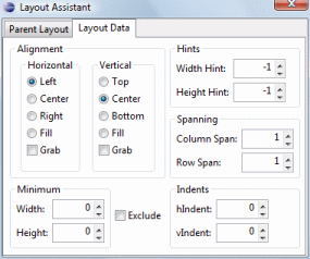
Layout Assistant |
Open the layout assistant for the layout manager associated with the selected container.
|
|
Align Left |
Align the selected components along their left edges. |
|
Align Center |
Align the selected components along their horizontal centers. |
|
Align Right |
Align the selected components along their right edges. |
|
Align Top |
Align the selected components along their top edges. |
|
Align Middle |
Align the selected components along their vertical centers. |
|
Align Bottom |
Align the selected components along their bottom edges. |
|
Replicate Width |
Replicate the width of the selected components. |
|
Replicate Height |
Replicate the height of the selected components.. |
|
Distribute Width |
Distribute the extra horizontal width equally for the selected components. If the Ctrl key is down, the left-most and right-most widgets will act as anchors. |
|
Distribute Height |
Distribute the extra horizontal height equally for the selected components. If the Ctrl key is down, the top-most and bottom-most widgets will act as anchors. |
|
Center Horizontally |
Center the selected components horizontally in the window. |
|
Center Vertically |
Center the selected components vertically in the window. |
|
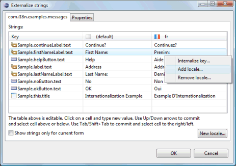
Externalize Strings |
Opens the Externalize Strings dialog.
|
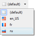
Choose Locale |
Choose the Locale to display the current widgets.
|