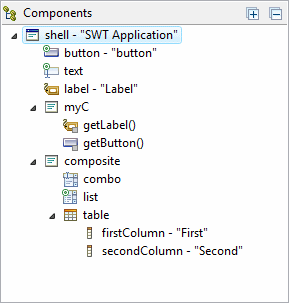
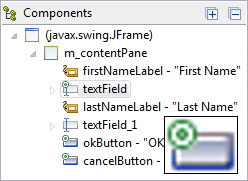
The Component Tree shows the hierarchical relationship between all of the components in the Design View.
Each component in the tree shows is icon (with potential decorators), its variable name and text label. Components may be represented as local variables or fields, and variable names must be unique within the scope in which the component is defined.
Icon decorators (see table below) are used to indicate whether a component defines and events or is exposed as a public component of a custom container.
Expand the components in the tree using the Expand All
 button, and
collapse them using the Collapse All
button, and
collapse them using the Collapse All
 button.
Right-click on an entry in the tree to access the same context menu available in the Design View. Components may be re-arranged in the tree via drag/drop and deleted using the Delete key.
Multiple components may be selected in the tree by holding down the Ctrl key to add individual selections or the Shift key to add contiguous selections.
Decorators
Icon |
Decorator Name |
Description |
|
Exposed |
Child widgets exposed in a custom container. |
|
Event |
Components with one or more event handlers defined. |

