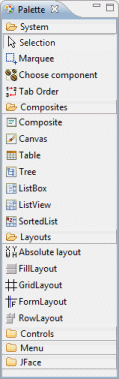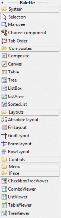
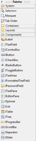
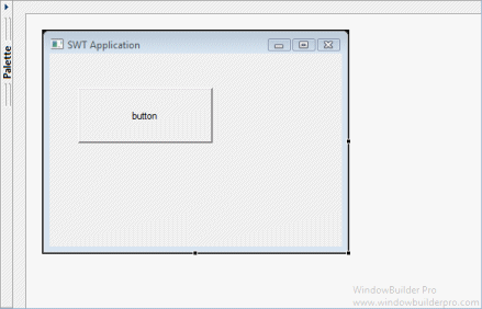
The Palette provides quick access to toolkit-specific components as well as any custom components installed by the user. The Palette is organized into categories which may be expanded, collapsed or hidden.
To add a components to the Design View, you can:
-
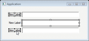
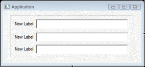
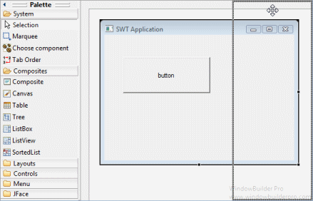
Select it in the palette and drop it on the Design View or Component Tree by clicking in the desired location.
-
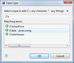
Use the Choose Component command to select the widget type from Choose Component dialog.
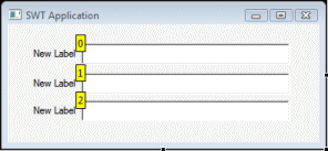
Multiple widgets of the same type may be added to the Design View by holding down the Ctrl key when selecting the widget in the Palette.
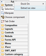
The palette may be customized by right-clicking anywhere in the palette to access the palette context menu or by opening the Palette Manager dialog..
The following commands are common to every palette:
-
Selection
-
Marquee
-
Choose component
-
Tab Order

Common Palette Commands
Icon |
Menu Name |
Description |
|
Selection |
Select one or more widgets. Hold the Shift or Ctrl key down to select multiple widgets.
|
|
Marquee |
Rubber band select multiple widgets. Hold the Alt key and start dragging to automatically activate the Marquee tool.
|
|
Choose component |
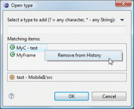
Adds a component to the editor. Enter the name of the class or select it from the history list. You can right-click on an item in the list to Remove from History.
|
|
Tab Order |
Set the tab order of the components. . Start by selecting the top-level container (such as the JFrame). . Activate the Tab Order tool. . Click the components in the desired order. Click a component more than once to increment its index. Shift+Click to exclude a component. Ctrl+Click to move the selected index to another component. . Deactivate the Tab Order tool by choosing another tool (such as Selection).
|


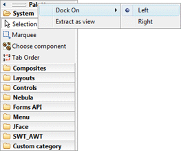
The position of the Palette may be configured via drag and drop or by right-clicking on the Palette header and selecting the Dock On command. The Palette may be docked to either the left or right side of the Design View.
The Palette may also be collapse and expanded on demand.
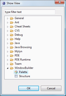
The Palette is also available as a standalone view. Use the Window > Show View > Other… command and open the WindowBuilder > Palette view or right-click on the Palette and select the Extract as view command. Closing the Palette view will make the Palette reappear as embedded view within the editor.