Understanding the Comparison
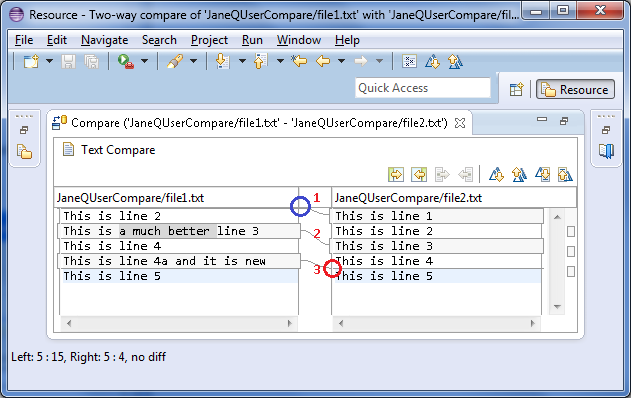
If you compare two files (file1.txt and file2.txt), the following results are shown in the compare editor. The
left side shows the contents of file1.txt and the right side shows the contents of file2.txt. The lines connecting
the left and right panes indicate the differences between the files.
You can double click on the editor tab to maximize the editor.

Looking at the numbered changes in the above image:
- Starting with the top line (in the left pane) we can see that the difference bar (in the area of the blue
circle) indicates something is missing from the very top of the left file. If we follow the difference band (see
#1) to the right file we can see that it contains "This is line 1" .
- The next line "This is line 2." is white indicating it matches the right file.
- Moving onto the next line (colored in gray) we can see that the left file and right file have different
contents for this line (see #2).Also, you can observe that a part of the line is highlighted. You can turn this
option off on the
 General > Compare/Patch
preference page.
- The next line ("This is line 4") is once again in white, so we can skip it, since the contents are the same in
both.
- The next line exists in the left file but since it is gray we follow its difference bar to the right (see #3)
and notice that the right file does not contain the line (see red circle).
Hint: On the right-hand side of the comparison, to the right of the scrollbar, there is a column which
shows a graphical representation of all differences between the resources. You can click on any of the segments
displayed there to quickly scroll to that difference.
Three way comparisons
Local history
Comparing resources
Synchronizing with the repository
Merging changes in the Compare editor
Resolving conflicts
Setting preferences for comparing files
Comparing resources with repository versions
Tiling editors
Compare editor
Compare/Patch preferences

